Thursday, May 10, 2018

Do I Even Have a Dream?!?! My Unconventional Journey to Interior Decorating

"Why is therapy office decor so important anyway?!?! What's the big deal? The clients aren't coming for spa day! They're coming for me to help them with their issues. Anyway, my clients don't seem to mind that it doesn't look pretty in here. I mean, it would be nice if my office was decorated nicely, but I wouldn't even know where to start!" -thoughts of many lovely therapists.

Interior Decorator,Therapy Office Design, Psychotherapy Tranquil Decor, Rockland County, NY

My name is Mimi Goldsmith and I am an interior decorator that specializes in creating calm and healing spaces. My very first project was a therapy office in a commercial space. That project actually sparked my love for design. It was truly a blessing that came at the perfect time. I had 4 young kids I was caring for and my hubby had just started med school that year. Let me tell you, it was rough! He was gone all day, ate dinner with us and then had video study groups the rest of the evening.

 
THE BEFORE PIC

He did warn me that it wasn't gonna be easy. He actually told me something kinda funny too. He told me that at his med school orientation, the Dean was giving a speech. He started with,  "Med school is no walk in the park. It will get grueling. It will ruin any social life you had. If you're in a relationship, it most likely won't last past the first year of school.  Are any of you married?" My hubby piped up,  "Don't worry, I pre-filed!" I know, terrible! But I thought it was hilarious (that's why we work so well together)!
So, that should give you a pretty clear picture of what med school life looks like. Life had made it's adjustment, but I couldn't keep up. I did try, but I was struggling. I was very happy that he was following his dreams, but I think watching him "go for it" made me realize how stagnant I was. I'm usually a pretty happy person, but the change of climate in my home made me feel like I was standing still, watching my life pass by.

 
ANOTHER SAD BEFORE PIC

What was my dream anyway?!?!  I was 38 at the time and I remember many times when I'd be hanging out with a friend, I'd turn to them and ask, "What should I be when I grow up?" They'd laugh and we'd move on to the next conversation. But I was really unsettled not knowing what my dream was. I mean, I was pretty busy having and taking care of kids for a good decade. But they were getting older and more independent and I just kept asking, what will I be when I grew up?

In the back of my head I kept hearing something a friend says when the new year comes around. She says, "G-d should bless you with a year of revealed good!" That is my favorite blessing! First of all, it's unique. "Happy New Year doesn't have that much oomph after you've heard it 30 times. Second of all, it's very powerful and helped me to really appreciate when I was actually able to clearly recognize the good in my life. Well, listen to the following and you'll see the kind of blessing that I got.

Interior Decorator and E-Designer, Style by Mimi G, blogs about a tranquil colors and decor needed to design a therapy office. Perfect for a Psychotherapist commercial or home office.

One evening, I went shopping with a good friend. We headed out to HomeGoods (do you also hear the angels sing when that word is spoken?).  As we shopped, my friend said, "I'm so excited, I found a space for my private practice office and I'm signing the lease tomorrow!" We hugged and I congratulated her. Then she said, "The only thing I'll need to do is decorate it, but I have no idea what to buy and where to start. Wait, Mimi, you'd be so good at that! You want to design my office (insert more HomeGoods angel singing here)?"  I answer, "Shut up! Really? Don't tease me!" We hugged (I may have jumped up and down in excitement) and my answer was a big fat, "YES!!!"

Interior Decorator and E-Designer, Style by Mimi G, blogs about a tranquil colors and decor needed to design a therapy office. Perfect for a Psychotherapist commercial or home office.

The next morning, I met the landlord so I could take measurements of the room. Well, before he even showed me her office, he was taking me to other offices that were still in construction phase asking me about paint colors for those offices. I know it's crazy, but I left the building with 2 projects that morning!!! I went home and starting doing research on interior decorating. Paint color! Lighting! Color palettes! Teaching myself a floor plan software program! I loved it all! I mean, I had always loved it. But once I started doing research for the projects, I realized how passionate I was about it. It was love at first sight. I had found my dream.

Interior Decorator and E-Designer, Style by Mimi G, blogs about a tranquil colors and decor needed to design a therapy office. Perfect for a Psychotherapist commercial or home office.

The evenings look different now. The fam eats dinner together, I put the kids to bed and then my hubby and I sit together on our own laptops.   We sit there for hours, him following his dream, and me following mine.  My frustration has been squelched and my passion has been stoked.  Realizing my dream had freed me. I am now able to love and embrace my life with joy. I am happier, which means that the family is happier too. All from a night out shopping with a friend at HomeGoods?  You could bet that it was all chance, but I put my money on revealed good.
Thank you for the blessing!

Interior Decorator and E-Designer, Style by Mimi G, blogs about a tranquil colors and decor needed to design a therapy office. Perfect for a Psychotherapist commercial or home office.

Hope you enjoyed hearing about my journey!  Feel free to leave a comment. I'd love to connect! If you are thinking about decorating your commercial or home therapy office (or really any room that you'd like transformed into a healing space), feel free to reach out to me. You can either fill out the contact form here or click here to choose a 15 min. time slot on my calendar to discuss your project with me.

Interior Decorator and E-Designer, Style by Mimi G, blogs about a tranquil colors and decor needed to design a therapy office. Perfect for a Psychotherapist commercial or home office.

WHAT'S COMING NEXT?

A new blog post describing the thought process I go through when choosing and positioning each item.  You'll also learn how the collaborative process works, seeing how a decorator and therapist work together to create the right experience for their clients.  The blog post will include a video interview with the therapist, recorded in her office. Together, we will discuss the process of transforming a room from looking like a DMV waiting room, into a calm space with healing energy. Subscribe to the blog if you'd like to get notified when new posts are published.

Interior Decorator and E-Designer, Style by Mimi G, blogs about a tranquil colors and decor needed to design a therapy office. Perfect for a Psychotherapist commercial or home office.

LASTLY, I'VE GOT SOME OPTIONS FOR ALL YOU DIYers!!!

I just launched a new service, "Therapy-Office-in-a-Click"! It's basically the bed-in-a-bag idea, for therapy offices! It's a budget friendly way to get the therapy office you've always dreamed of. It includes links to everything from furniture, plants and decor items down to inspiration stones and soothing scented oils. For all the details, head to my services page!

I just finished writing an e-book called, "A step-by-step guide to decorating your tranquil therapy office." Follow this link to check out the details!
If you'd like to receive the therapy office decor tips, just enter your info in the banner at the top of the page of my official website.

Interior Decorator and E-Designer, Style by Mimi G, blogs about a tranquil colors and decor needed to design a therapy office. Perfect for a Psychotherapist commercial or home office.

Interior Decorator and E-Designer, Style by Mimi G, blogs about a tranquil colors and decor needed to design a therapy office. Perfect for a Psychotherapist commercial or home office.

 Interior Decorator and E-Designer, Style by Mimi G, blogs about a tranquil colors and decor needed to design a therapy office. Perfect for a Psychotherapist commercial or home office.

Tuesday, June 13, 2017

Traditional Master Bedroom Design (with a modern twist)


 BEFORE...

                            
AFTER...

There's nothing that tops the feeling of a returning client! I had the privilege of working with this client when she updated her living room. Since then, every time I would see her, she would tell me, "It's not right! Every time I walk into my living room, I cannot help but smile and have a sense of serenity. Then, I walk into my bedroom and I'm jealous of my living room!" She told me that she never realized how surrounding yourself with beauty was so important for your well-being.
Finally, when she couldn't take looking at her blah room anymore, I got the call to design her bedroom. Her bedroom set had Old World style with regal elegance. She had a big cozy wingback chair that was perfect for curling up with a book. Everything else had to go!
After discussing the style and feel of the room with my client, I came up with a plan. Traditional romantic sophistication with a modern twist. I started with choosing paint. The walls were a very pale pink, which did nothing for the room. I searched for a rich corally pink that would complement the wood tones of the furniture. I first tried a few samples on the wall before I made a final decision (NEVER skip this step! Unless, of course, you really like re-painting).
The room was painted and then, it was shopping time! I found all these pillows at Homegoods in one trip, and if you know the store Homegoods, you know that was nothing short of a miracle! I styled them on my client's bed and she was sold.  It was love at first sight!


This Kravet duvet cover is gorgeous! It has an animal-like print on it, with metallic silver speckled detail. I layered on a faux fur throw to add more luxury, texture and interest. Although there are a bunch of different patterns in the bedding, they work because they are all neutral. If you stick with a tight color palette, you can really get away with a lot (especially when you're dealing with neutrals)!


In our last project together, my client loved the added energy that color brought to the room. Not wanting to upset the feeling of tranquility, I made sure to carefully sprinkle color throughout the room, maintaining the feeling of tranquility. Framing these sheets of handmade marbled art in gold was not only simple, but was a great starting point for the color palette. DIY at it's best!


To lighten up the mood of the room, I added a splash of modern. Marbled art in clean-lined frames, white fur rugs, a simple tall glass vase and other decor brought this traditional room to 2017.


I looked for a mirror to bounce some light around the room. I wanted it to be subtle, so the room would maintain a serene feel. This mirror really caught my eye. The ivory colored shell tiles are elegant, yet quiet. I also love how the curves in the mirror echo the arches in the art deco pillows.


This hanging planter was actually sold as a lantern. It came with a glass cylinder which I removed, creating this magnificent beauty. I went to the local nursery and picked up 5 small ivy plants. I cut a plastic planter down in order to fit it in the lantern "cage". I placed each plant inside, through the "cage", one at a time. So worth the effort! Love how it turned out!


The candles dispersed throughout the room promote a calm surrounding and a perfect place to reflect and meditate (another request of my client). My client recently told me she was away on a trip. When she returned, she was completely drained. She got home, opened her bedroom door, sighed with relief and then smiled. The most rewarding part of my job is knowing that my completed projects becomes the daily joy of some really wonderful people!


Love what you see? Tired of endlessly pinning items on Pinterest that you never actually purchase? 

I can help you create a home you love!

I have 3 service options available; E-Design, Full Service, and 2-Day Styling Service. Visit my services page for full details.


WOULD LOVE YOUR FEEDBACK! SCROLL DOWN TO LEAVE A COMMENT!

Wednesday, November 30, 2016

Designing a Student Lounge

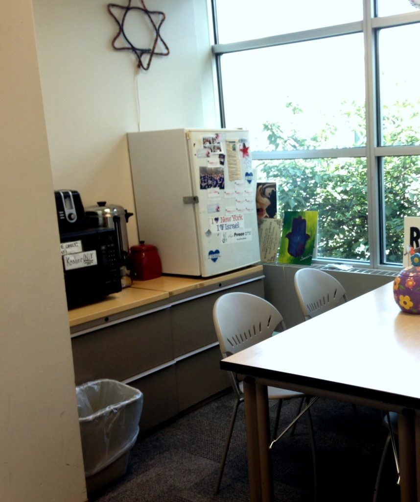
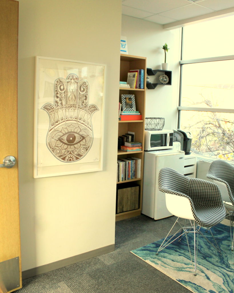
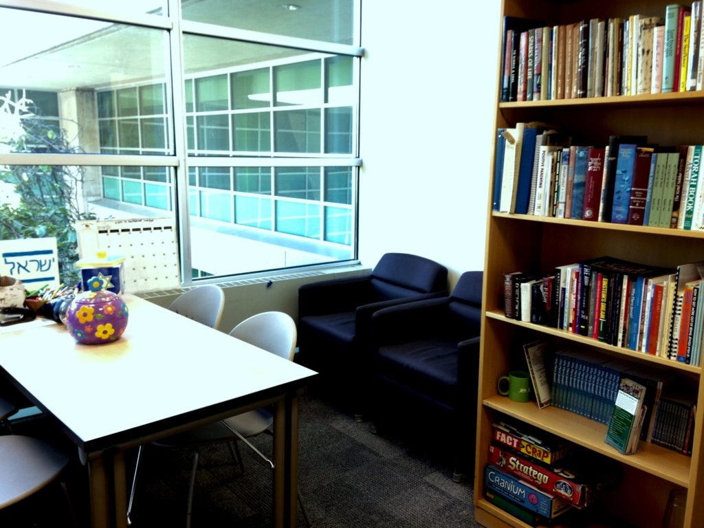
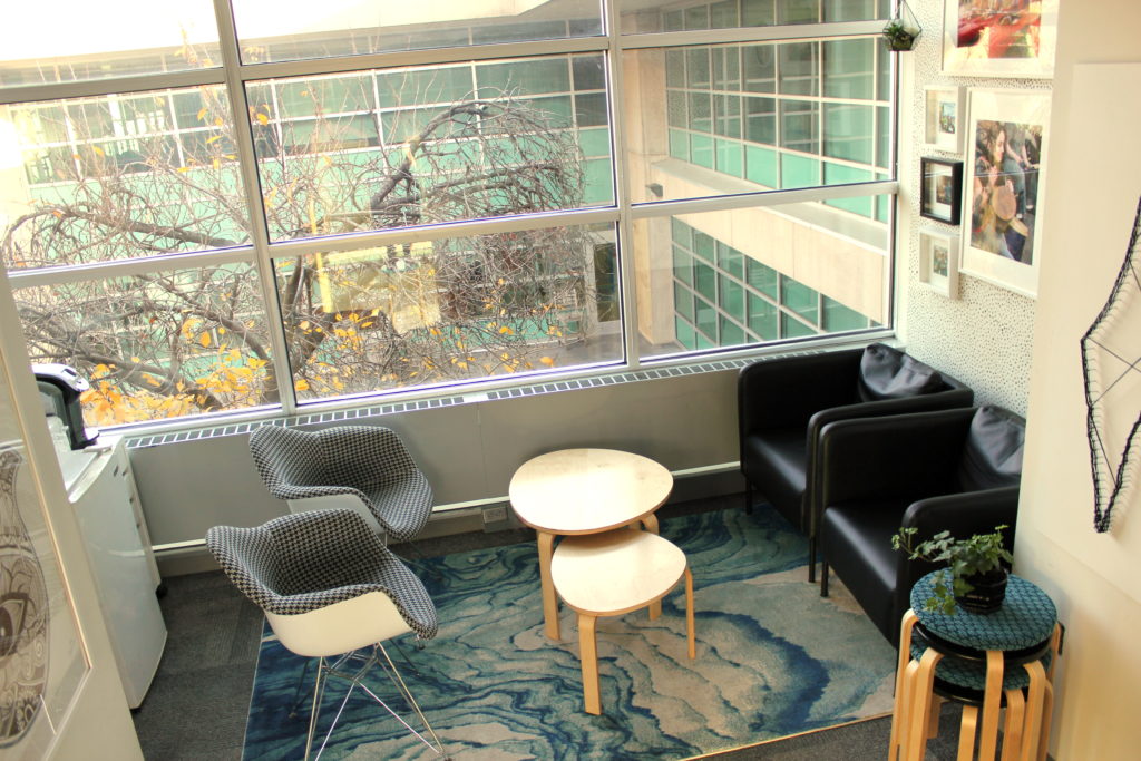
My clients run the Center of Jewish Life/Hillel of Rockland College.  Thinking about updating their Hillel student lounge for a long time, they decided to reach out to me. I was more than happy to take on the job.  I knew it would be an exciting challenge! My clients wanted to change the room's vibe from boring lunchroom to fun lounge/hangout. The room was pretty small, so the first thing I did was booted all of the original items/furniture that were not necessary. The only things we kept were the bookcase and fridge.  The replacements would all be budget friendly and have a tight palette so the room would not feel too busy. We chose black and white with pops of blue. Once that was figured out, a-shopping I did go!
So, how do you make a room with boring grey wall-to-wall office carpeting look fun and fresh, you ask?  Drop a great rug on it!  The first purchase I made was this amazing rug that looks like the tide coming in on the shore. I knew it would bring some life to the room and steal the show!                                                                                                                                                                                                          img_2198-001
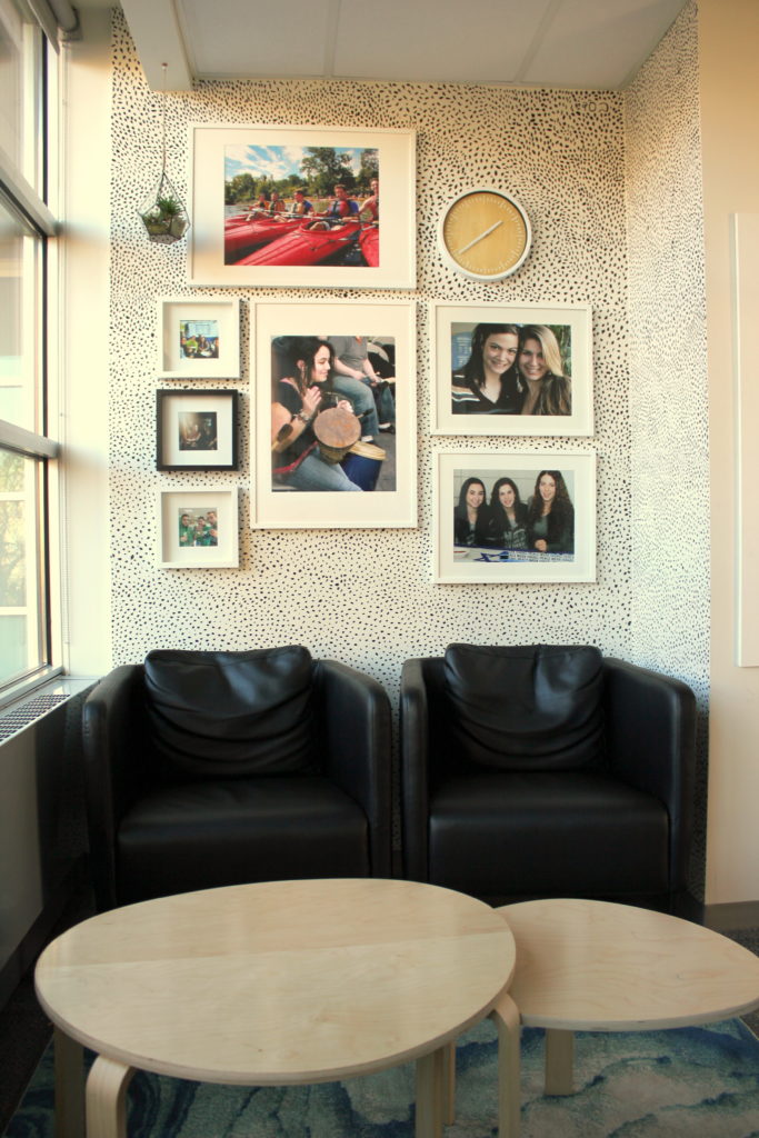
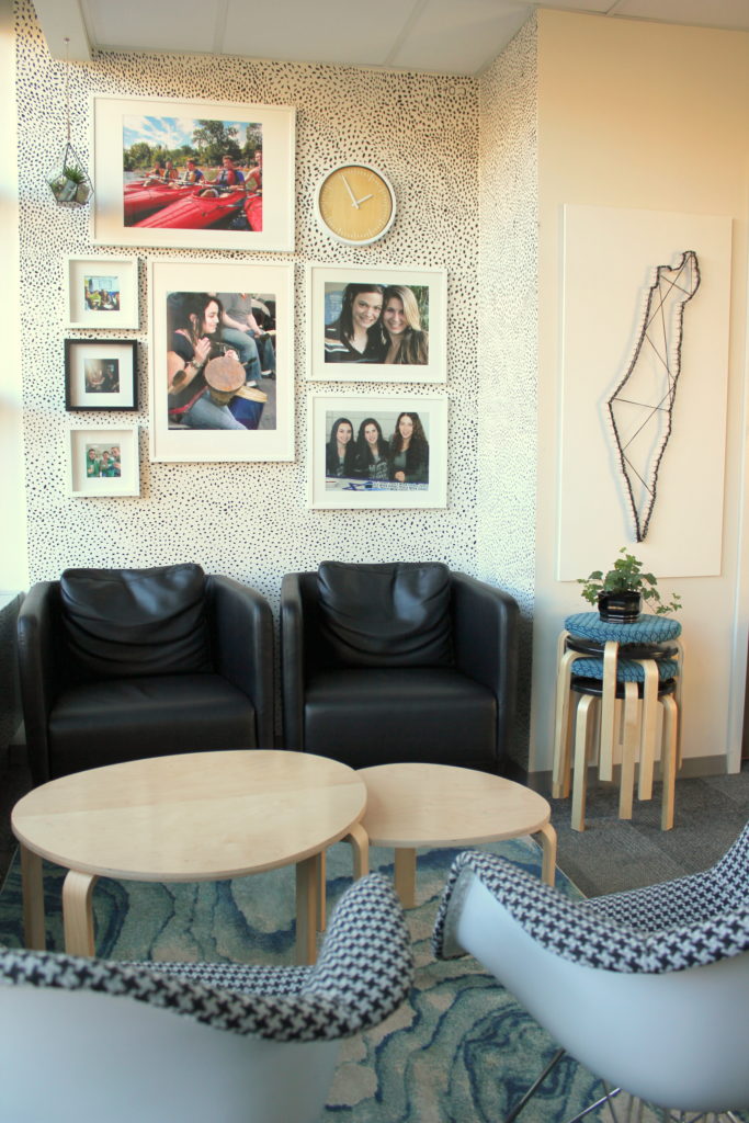
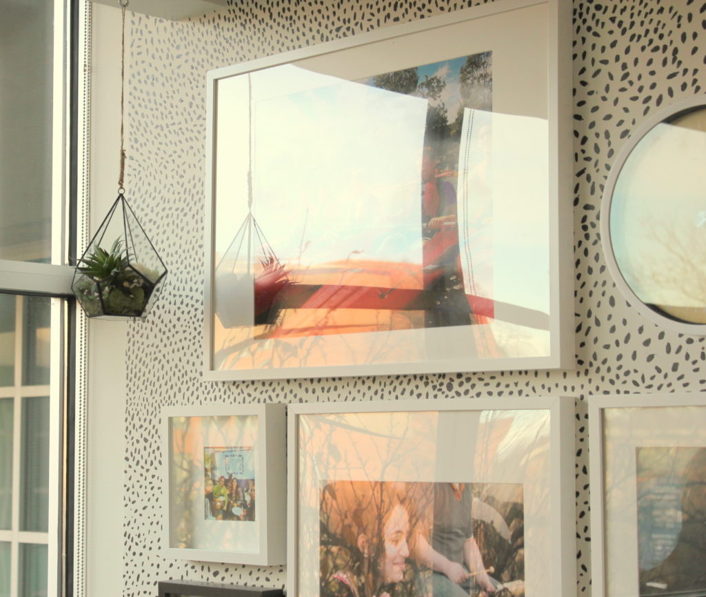
My clients wanted to hang up some pictures of the students, so I decided to create a gallery wall. All white frames would be nice and clean looking, but this is a student lounge, so I thought we should have some fun with it! I wanted to have a black and white speckled background for the gallery wall. I originally planned on using speckled wallpaper but that would have taken us way over our budget. Luckily, my clients had many wonderful students that were willing to volunteer! Out with the wallpaper, in with the hand-painted speckled wall!!! They did an amazing job!img_2106-001
For all you peeps that are dying to get some wallpaper on your walls but can't afford it, DIY it! Okay, it would take a really long time to do this yourself, so call over some friends. You may want to make a one drink limit, unless you're going for a modern art look. In which case, you may as well get your kids to help you. Then when you and the kids finish the walls, you can celebrate with your friends and go out for those drinks! Both are very good options. There are so many great ideas out there for DIY accent walls. You can head over to my Pinterest DIY board to check out some that I've pinned -https://www.pinterest.com/StylebyMimiG/diy-ideas/.
The rest of the room was all planned out. I knew the Hillel lounge needed some Israel-related paraphernalia but I didn't want it to be cheesy(AKA, big poster of the map of Israel, etc.).  I decided to create a modern asymmetrical string art of Israel. Check out this great tutorial I put together. If you have any questions, don't hesitate to ask!
img_2153-002
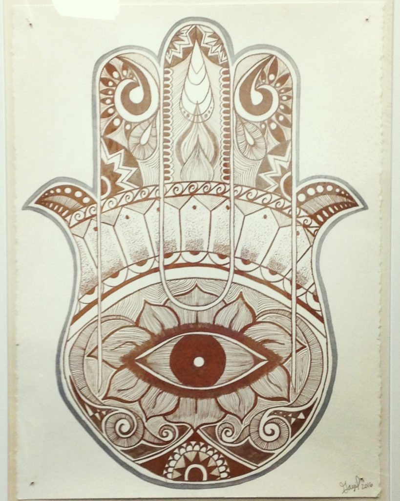
I also commissioned one of the students, Gayil, from Hennas by Gayil (https://www.facebook.com/hennasbygayil/?fref=nf), to create a drawing of a Chamsa. I had seen her work before and knew she was extremely talented. Well, she did not disappoint! Check out the beautiful detail in this drawing!!!
img_3483
I wanted it to have an authentic look, so I had her draw on paper with raw edges and pinned it onto the matting of the frame.
img_2124-003
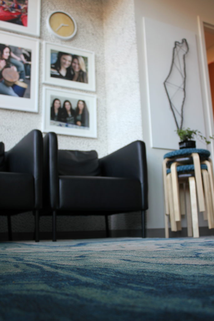
When it was time to shop for furniture, I searched for simple, fun and modern. For the chairs in front of the gallery wall, I chose black leather chairs to help that wall feel grounded. Two mid-century modern chairs in black and white houndstooth material were placed opposite the speckled wall. The pattern of the fabric helped create balance, adding a similar splash of black-and-white-crazy to the other side of the room.
img_2117-001
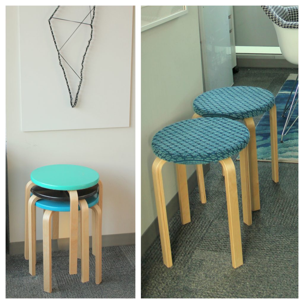
I chose simple birch nesting tables to add a natural element to the room. The matching stools brought balance to the other areas of the room, while affording extra seating when needed.  I customized the stool tops to add some texture and color to other parts of the room. I stuck to our tight color palette when choosing the fabric for upholstering and the paint for the stool tops.
FROSTA Stool IKEA The stool can be stacked, so you can keep several on hand and store them on the same space as one.
http://www.ikea.com/au/en/catalog/products/60162301/
This is the Frosta stool from Ikea. It is so affordable and you can customize it in so many ways!
                                                                                                          collages
I am a big believer in bringing life to a room by adding live plants. I scoured the internet for a cool hanging planter and found this gem-of-a-gem-shaped glass hanging planter. I created a beautiful terrarium, layering pebbles, varied types of dried moss and a succulent plant.
img_2231-001
I always choose succulents to add to client's rooms, because they are hardy and most people are unintentional-plant-killers ;).
The Before...and Afters
img_2986-edit
before
img_2199-001
after
img_2985_new
before
img_2198-001
after
img_2225-001
 img_2155-001
Love what you see? Tired of endlessly pinning items on Pinterest that you never actually purchase?
I can help you create a home you love!
I have 3 service options available; E-Design, Full Service, and 2-Day Styling Service. Visit my services page for full details.
WOULD LOVE YOUR FEEDBACK! SCROLL DOWN TO LEAVE A COMMENT!

Wednesday, July 6, 2016

Airmont High-Ranch

Let's begin with everyone's favorite part,
the before...


and the after...


The owners of this high-ranch contacted me right before they moved into their new home.  They are a sweet couple with young children. They wanted to move away from the traditional look they had in their old place, to a more modern look. The only furniture they brought to their new home, was a hutch that had sentimental value to them.


The hutch was very traditional, so I kept that in mind while choosing the furnishings.  The tufted accent chairs, tufted ottoman, and the bling from the different metallic accents, add elegance to the modern look.    
With their open-floor plan, it was very important to choose kid-friendly furniture. I did what I could to help my clients avoid the-parents-face-of-horror. You know, the face parents get when their sweet innocent toddler hops off the dining room chair heading to wash the spaghetti sauce off their cute little hands and, on the way, making sure to touch...EVERY...SINGLE...SURFACE (I know you've been there!)!!!  So, I stuck with leather for the sofa and ottoman/coffee table and dark teal velvet for the accent chairs.


The husband really liked the black and white look, so I chose these throw pillows to go with this amazing ottoman/coffee  table. I stuck to black, white, neutrals and small pops of different shades of teal to tie the accent chairs into the room (here's the color palette I referred to: https://www.pinterest.com/pin/252342385350257891/).  I added lots of texture and, of course, a lot of plants!


I created this unique arrangement of decorative items on a round tray by adding very cool looking succulents to this black pedestal vase and added a pretty oval bowl. Together they create nice contrast and break up the boxiness of the white squared vase. 


I planted a trailing succulent plant in a hammered copper cup and ended up with this beauty!  


These coasters are beautiful! It's good I don't have them at my house, because I'd find any excuse to use them and end up with a drinking problem! 


Love what you see? Tired of endlessly pinning items on Pinterest that you never actually purchase?
I can help you create a home you love!


I have 3 service options available; E-Design, Full Service, and 2-Day Styling Service. Visit my services page for full details.


WOULD LOVE YOUR FEEDBACK! SCROLL DOWN TO LEAVE A COMMENT!